Digital Influx
Overview:
During the testing of our old website a Facebook ad campaign was run to test the bounce rate (retention time) of the website and what effect this had on the number of sign ups to our course. We found that the website had a very high bounce rate, and that a redesign was needed in order to increase retention time by making the site more inviting, establishing a new brand message and developing a new brand style guide that can be used across the site and on our social media platforms.
Challenge:
The challenge of this project was finding a message and look that defined who we are as a brand and how we wanted to be represented as a course and company.
The solution to this challenge would help us get more sign ups for our free trial course once our course was officially released.
Roles: UX/UI Designer
My role as a UX/UI designer during this project was to design the user experience and user interface of the website landing page and any subsequent pages, as well as help develop a brand style guide that could be used site wide together with a visual designer.
In addition to the design of the website I also worked together with an ex-Google copywriter to establish the brand's tone of voice.
Duration: 1 month
Goals:
- Inform the user of safer routes such as those that well-lit.
- Offer the user the quickest route home without sacrificing safety as well following routes with sufficient footfall.
- Reassure primary and secondary users by allowing them to call and alarm trusted contacts quickly if the are feeling unsafe.
- Connect to the speakerphone and/or camera to speak to a trusted contact live whilst on their journey.
- Have an active camera and voice recording operating throughout the journey for reassurance and evidence in case of an incident.
- Have an active camera and voice recording operating throughout the journey for reassurance and evidence in case of an incident.
The Research Process
During the research process the visual designer and I used Miro to create a visual analysis deep dive into multiple KPI’s and business models of direct and indirect competitors to compare and contrast commonalities, differences and opportunities. The reasons for this analysis was to to:
- Understand where our product stands in the market
- Inform the design process
- Know the strengths and weaknesses of our competition
- Have reliable evidence when making product changes
- Inform the design process
- Know the strengths and weaknesses of our competition
- Have reliable evidence when making product changes
This analysis included a breakdown of each competitor's landing page as well as a competitor landscape graph to create an initial tone of voice for our brand to give to the copywriter later on in the project. The main aim of these exercises were to see where our competitors stood in the Ed-tech space and where we fit among our competitors.
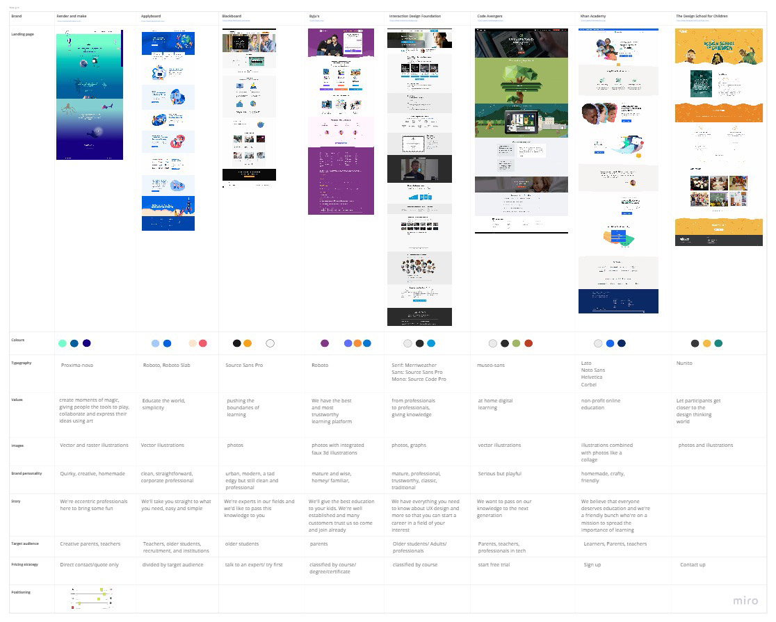
Competitor Analysis
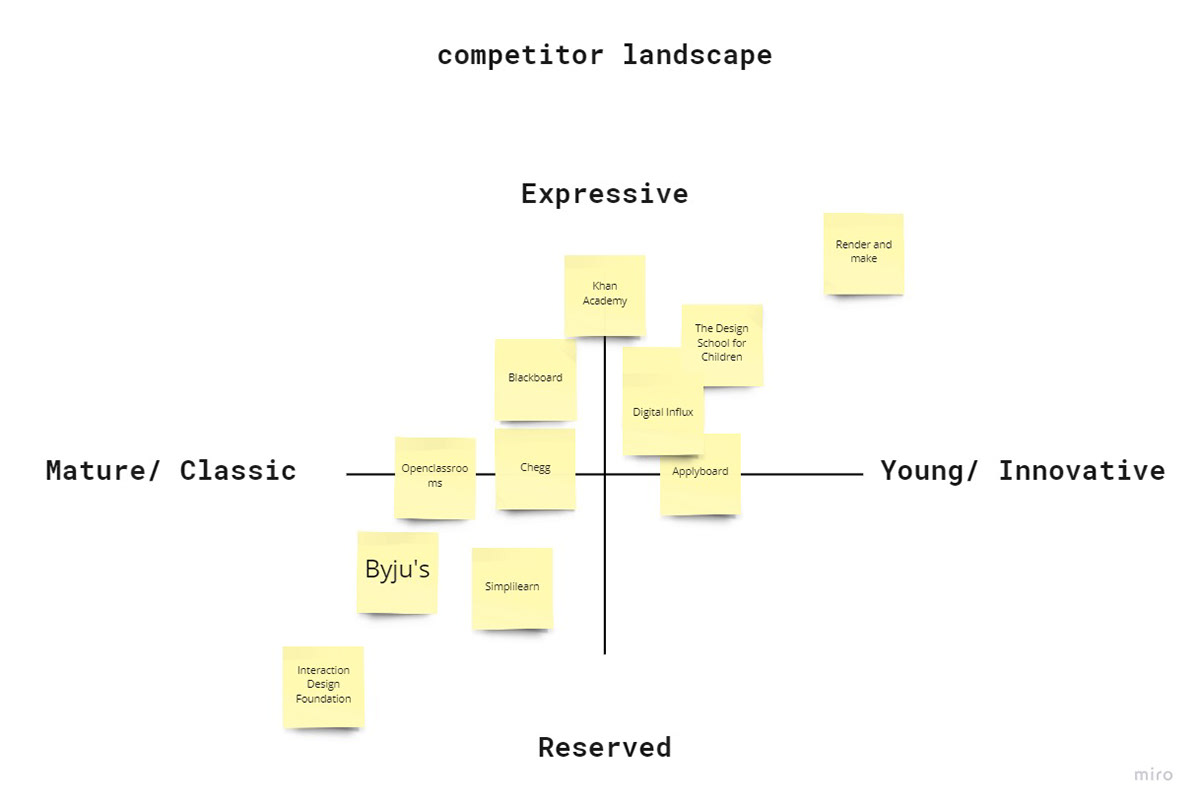
Competitor Landscape

Brand Tone of Voice
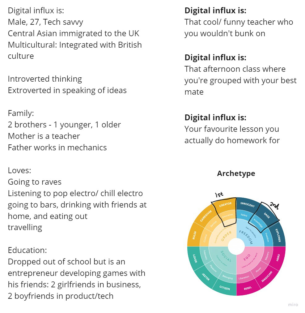
Brand Breakdown
The outcome of this analysis led to the creation of two personas; teachers and parents, who are our target users. These personas can help us create reliable and realistic representations of our key audience for future reference during the ideation and designing phase. These personas also helped the company as a whole as these could be shared across the various teams (marketing, games, design) so that we all understood who our target users were.
Initial Sketches
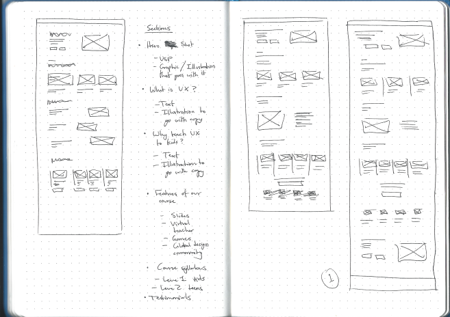
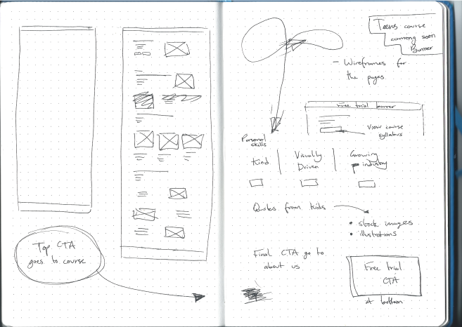
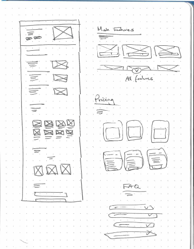
Wireframes
After user testing with the initial wireframes were completed, a new set of wireframes were produced, resolving the key issues of the previous wireframes. After evaluating and reflecting on the design journey so far, I was then ready to create the final high-fidelity screens.


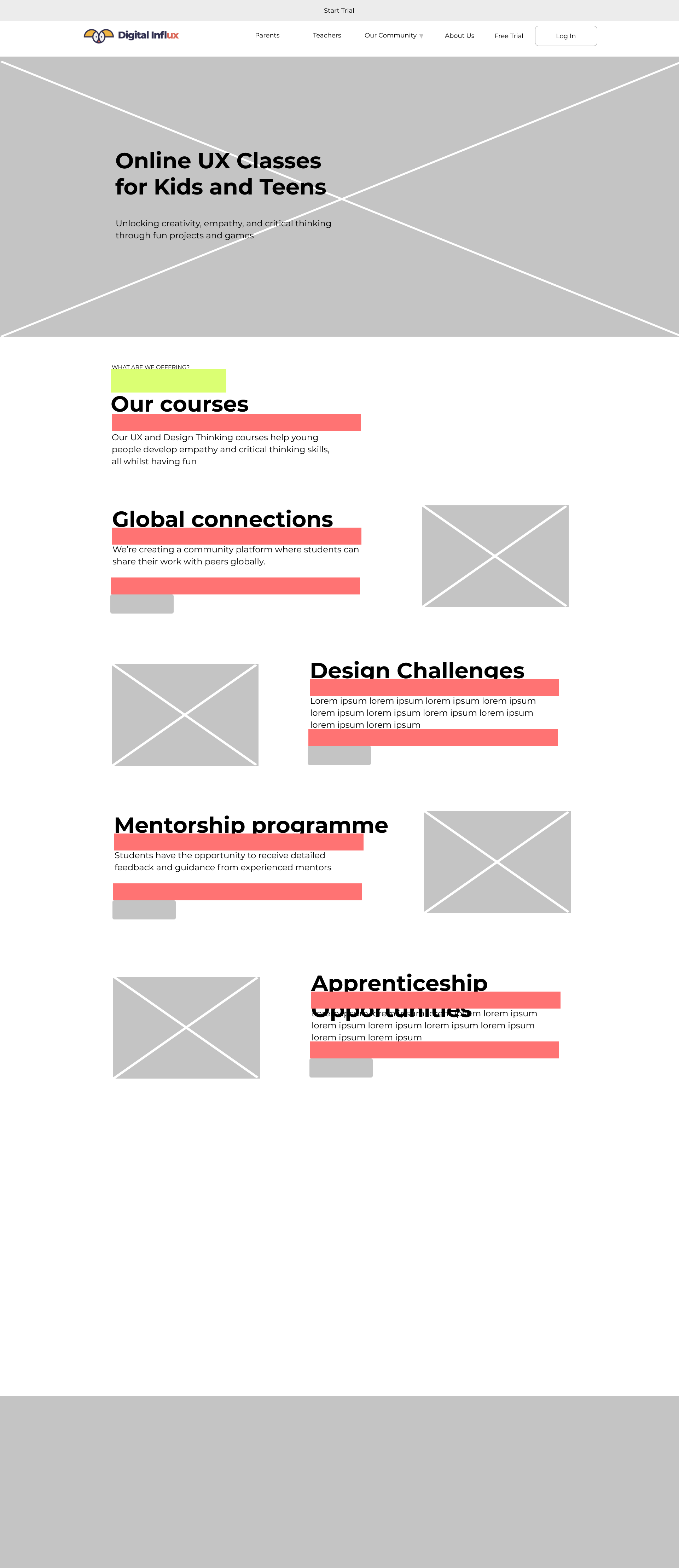

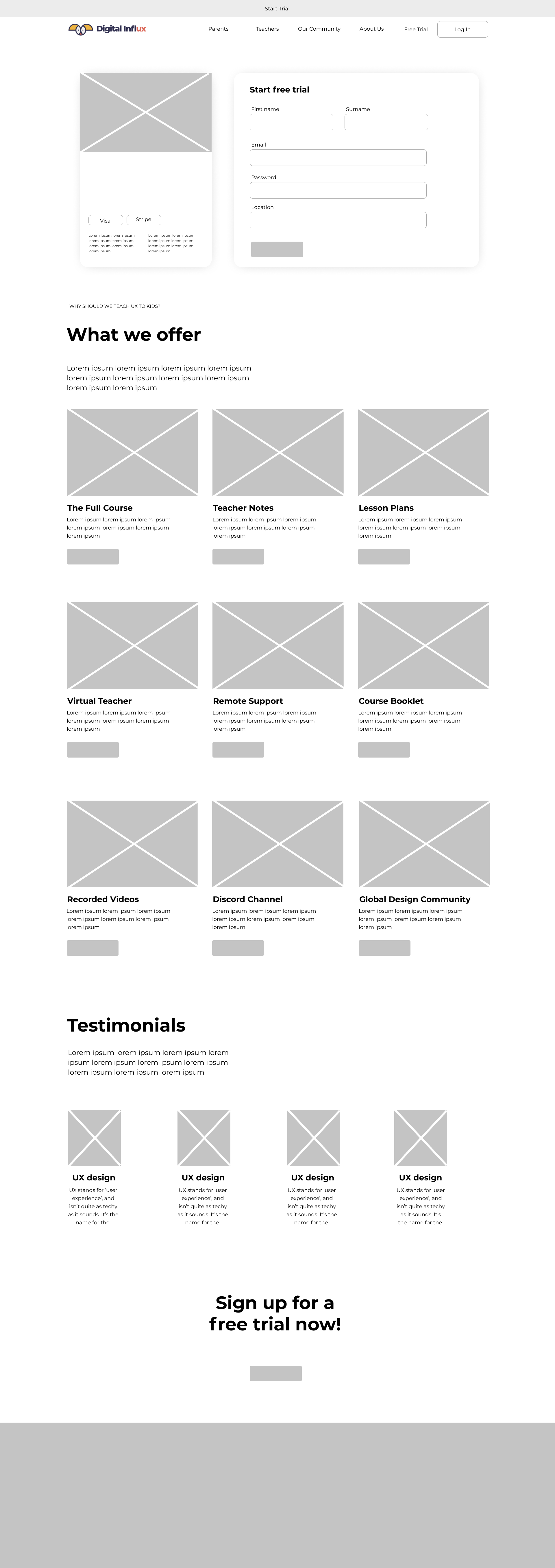

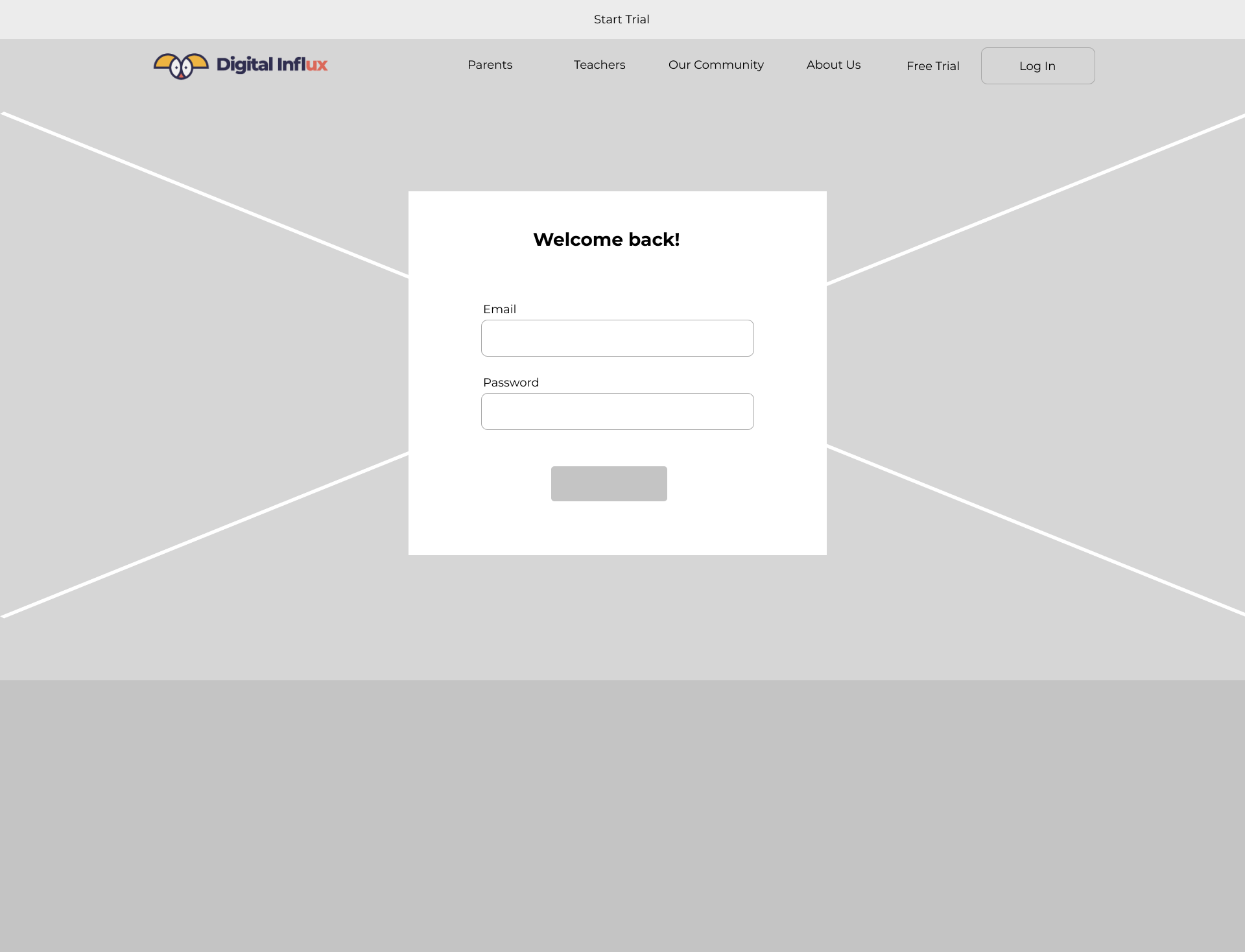
Once the wireframes had been finalised and agreed on I moved onto working with a visual designer to create a style guide for the user interface of the website and any other design work within the company in the future as we did not have one previously.
Brand Style Guide
The brand style guide that I helped to create included the right way to use our brand logo, colours, typography and imagery. The research gathered from our competitor analysis helped determine what we wanted our style to be and how we could stand out amongst our competitors. This style guide was also made because many of our previous designs looked drastically different to one another depending on who designed it, so this will help to create consistency across our products, website and social medias'.


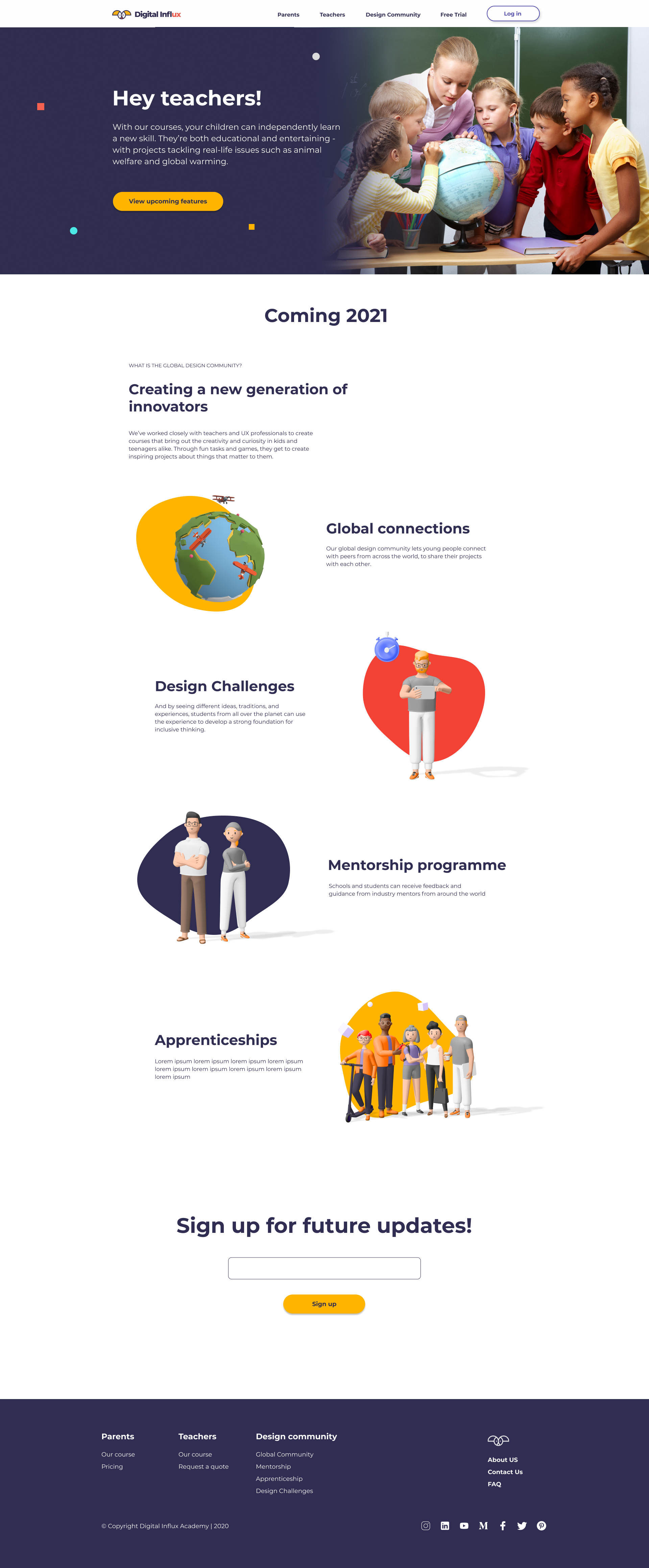
Final Screens
These are the final designs that were then handed to our developer so that they can start the development of the website. During this pass-over phase I made sure to try and make the process as easy as possible for them by preparing all of the assets before hand as well as making quick GIF animations in Figma for any micro interactions that I wanted to be in the webpage. This was important as it helped me communicate my design intent for the micro interactions and animations, as well as change them if needed so that we could get the pages completed in the time frame given.


Findings, Insights and Takeaways
This website redesign was my first real-world UX project whilst working as an intern at Digital Influx, which resulted in an incredible amount of new skills and experiences being learnt during the whole process. This experience allowed me to develop incredibly fast due to being given a huge amount of creative freedom as well as responsibility, partnered with supporting co-workers who were there to guide me in times of need. The main takeaways from this project were:
- How to use motion design to communicate my design ideas about micro interactions and animations for the website with my team, which I found added to the confidence others have in your designs as they can see more clearly what it would look like once developed.
- How to design a website and what the stages in doing so were, such as creating and using a grid and style guide for the first time to ensure design cohesion across all pages. Learning about the importance of typography and how this can effect the way your message is conveyed was also an new eye-opening experience to me.
- How to cope with intense deadlines and quick turnarounds within a start-up environment, as well as how much these decisions can impact the success of the company and the implications my designs have on that success.
- Lastly, I made sure to make diversity and representation a key focus during the design process when it came to choosing images and imagery for the website, as I wanted the users who go on to navigate the site in the future see that these are things we value in our company and brand.
